
Monday, 17 December 2018
Sunday, 16 December 2018

Sunday, 2 December 2018

Saturday, 1 December 2018

Monday, 15 October 2018

Sunday, 14 October 2018
Production - Website Progress
HOMEPAGE
I used Wix to create my own website to compliment my print. I inserted 3 of my images to create 3 different linked pages - makeup, fashion and lifestyle.

I then changed the background photo to my own image inserted a social media bar and headings to linked pages. I also enlarged the masthead and changed to a pink and orange colour scheme.

I decided it looked more professional to view the homepage linked pages as a sliding bar. I also added the selling line. The font of the masthead is consistent with that of the print to ensure brand identity.


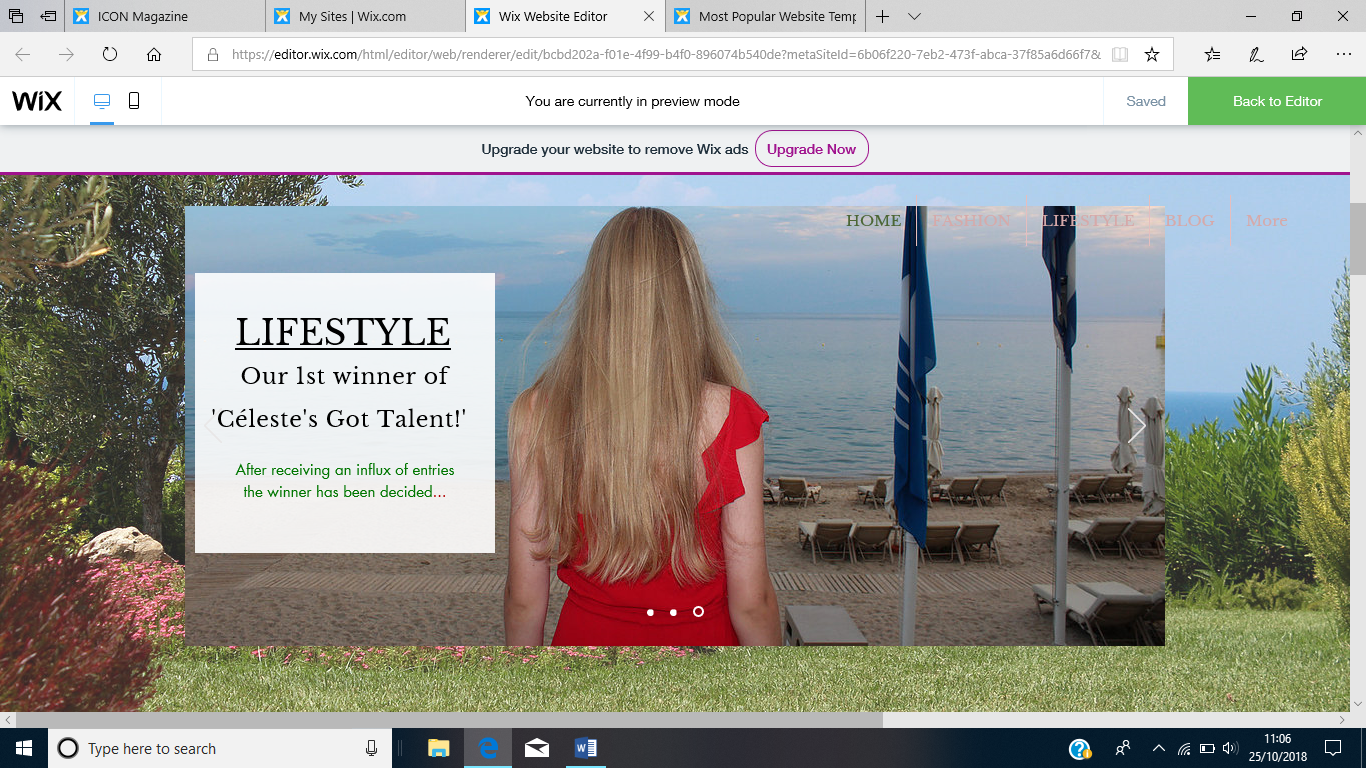
On my homepage I created links to blog pages about issues and trends I believe my target audience would identify with. There is the opportunity to engage with these posts through liking the posts.


However I also created a holiday advert appealing to the target audience who seek luxury escapism. After audience feedback I decided to remove the adverts of the girls as they looked less professional the holiday advert.

FASHION


I adapted the layout of the page as I feel this format is far easier to follow. Intertextuality is evident through references to 'Flashdance'.
BLOG

LIFESTYLE
I believe introducing the reader as a star is a good way to ensure audience participation.

ABOUT

CONTACT
I believe this linked page is vital to encourage audience participation.

Thursday, 27 September 2018
Production - Contents Pages Progress

I began by creating a single page contents for my natural edition.

However after careful consideration to tie in with the brand identity I decided to make a double page contents to match up with the 80s double page contents.
I used the same colour pale pink colour scheme as the natural front cover. I also used the exact same typography as the masthead on both front covers for brand identity.

I asked members of my focus group to vote for which one was best they all decided the first looked more professional and similar to my other contents.

I feel they both convey a clear sense of brand identity. I also used the same typography from my 80s front cover to be transferred to my contents.
Wednesday, 26 September 2018
Audience Research - Focus Group Feedback


Focus Group that fit target demographic:
Danielle - 25 years old
Georgina - 17 years old
Megan - 17 years old
Millie -17 years old
Fabian - 18 years old
Teddy - 19 years old
Luke - 16 years old
There was a choice of of 3 images for my 80s front cover:
Image 1 - Pink Dress -did not have any votes
Image 2 - 80s jumpsuit by wooden door - Had four votes
Image 3 - CU through fence - Had four votes
So after receiving more audience feedback I choose image 2 in the 80s jumpsuit because it clearly defines the theme of the magazine and image 3 would be very difficult to ensure the masthead is placed correctly over the fence.
Tuesday, 25 September 2018
Production - Print Draft 1 - Both Front Page and Contents Page

Aimed this fashion magazine at young female's (16-18 yrs) with interest in bloggers/makeup etc
Intertextuality - Shakespeare quote from Midsummer's Nights Dream
Consistent - pale pink, white and black colour scheme

Aimed this fashion magazine at female young adults (21-25 yrs) with interest in culture and sophisticated fashion
Intertextuality - Crawford (supermodel from 80/90s) Flashdance (80s film)
Consistent colour scheme - red, white and black same masthead font
PRINT DOUBLE PAGE SPREAD CONTENTS

I decided to choose this photo for my contents due to the eye catching colours and 80s aesthetic.

I decided to use to clone tool on Photoshop and edit to ensure the background next the beach hut was removed.
Single contents page - same colours as front cover pale pink and black
"we publish the BEST of your 80s inspired looks" - alludes to first edition
Veganism, ethical clothing and Charlotte Tilbury - adheres to audiences interests
"Good on you app!" - Intertextuality


Thursday, 23 August 2018
Planning - 80s Shot List
Shot No.
|
Shot type
|
Location
|
Shot Description
|
Model
|
Clothing/Makeup
|
1
|
Extreme CU
|
N/A
|
CU of eye
|
Marnie
|
Bright 80s eyeshadow
|
2
|
Medium
|
Int
|
80s toys laid out
|
N/A
|
N/A
|
3
|
CU
|
Ext - At Tennis Club
|
Shoot through metal fence – direct eye contact
|
Dani
|
Big earrings / red lips / glowing
|
4/5/6
|
Medium long shot / medium
|
Beach hut by Uncle Toms
|
Roller skating then posing against beach hut then one with lolly pop
prop
|
Dani
|
Teal leotard and skates
|
7
|
CU
|
By the beach
|
Shot of feet
|
Dani
|
Roller skates and leg warmers
|
8/9
|
Medium
|
Brick wall / plain wall
|
Posing against wall then sitting on floor with one arm stretched
across leg
|
Dani
|
Gold jumpsuit / pink dress
|
10
|
Medium CU
|
Lounge by chaise longe
|
Flashdance shot – intertextuality
|
Dani
|
Slouchy jumper/ point heels/ drop earrings
|
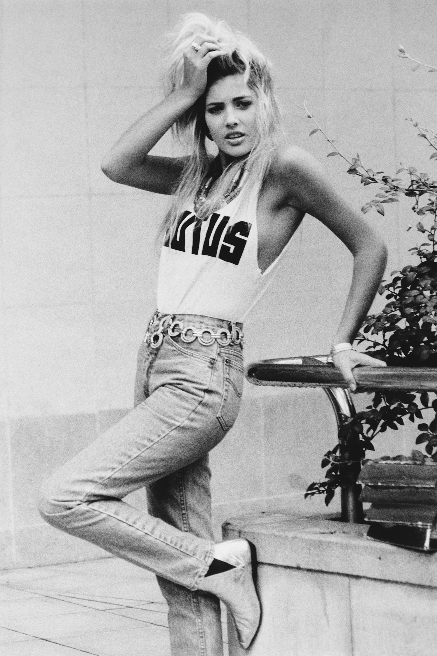
Shot 3 - I aimed to recreate Cindy Crawford's style shot who was a model in the 80s - through the pose and parting of her lips and big hoop earrings.
The big hoop diamond earrings I used were a symbol of wealth and power in society hence why diamonds and pearls were popular among many women.
.


Wikipedia: During the 1980s and 1990s, Crawford was among the most popular supermodels and a ubiquitous presence on magazine covers, runways, and in fashion campaigns. She was repeatedly and frequently featured on the cover of many magazines, including Vogue, W, People, Harper's Bazaar, Elle, Cosmopolitan, and Allure.
Shot 8/9 - Bright colours were very popular in the 80s - the bright pink dress I used in the shoot was actually an original 80s piece.
Shot 10 - I aimed to recreate an intertextual reference to Flashdance a film created in 1983. My model wore a chunky knit sweater off the shoulder and heels in order to adopt this relaxed style.

Tuesday, 17 July 2018
Planning - Front Cover Inspiration - 80s Issue


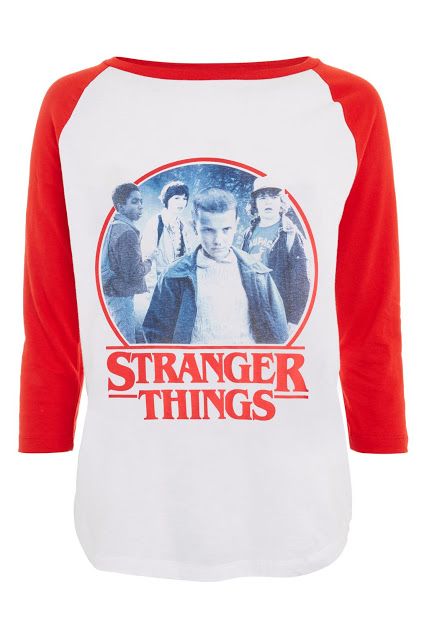
stranger things shirt - how 80s still relevant to today?
More ideas:
https://www.rollingstone.com/tv/tv-features/stranger-things-how-netflixs-retro-hit-resurrects-the-eighties-109430/
Subscribe to:
Posts (Atom)

-
Examples; Major players in industry - Competitors of Bauer Media 1) Condé Nast For nearly 100 years, Condé Nast International has s...
-
 Focus Group that fit target demographic: Danielle - 25 years old Georgina - 17 years old Megan - 17 years old Millie -17 years old Fa...

