HOMEPAGE
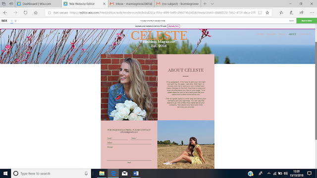
I used Wix to create my own website to compliment my print. I inserted 3 of my images to create 3 different linked pages - makeup, fashion and lifestyle.

I then changed the background photo to my own image inserted a social media bar and headings to linked pages. I also enlarged the masthead and changed to a pink and orange colour scheme.
I decided it looked more professional to view the homepage linked pages as a sliding bar. I also added the selling line. The font of the masthead is consistent with that of the print to ensure brand identity.
On my homepage I created links to blog pages about issues and trends I believe my target audience would identify with. There is the opportunity to engage with these posts through liking the posts.
However I also created a holiday advert appealing to the target audience who seek luxury escapism. After audience feedback I decided to remove the adverts of the girls as they looked less professional the holiday advert.
At the bottom of the page I created a collage with images I believe are relevant to my target audience. There is also a subscription option which allows audience engagement.
FASHION
This is my first draft of my linked fashion page. On this page I have described 4 looks that reference the 80's linking to my first issue.
I adapted the layout of the page as I feel this format is far easier to follow. Intertextuality is evident through references to 'Flashdance'.
BLOG
LIFESTYLE
I believe introducing the reader as a star is a good way to ensure audience participation.

ABOUT
CONTACT
I believe this linked page is vital to encourage audience participation.


No comments:
Post a Comment